← Docs
Documentation
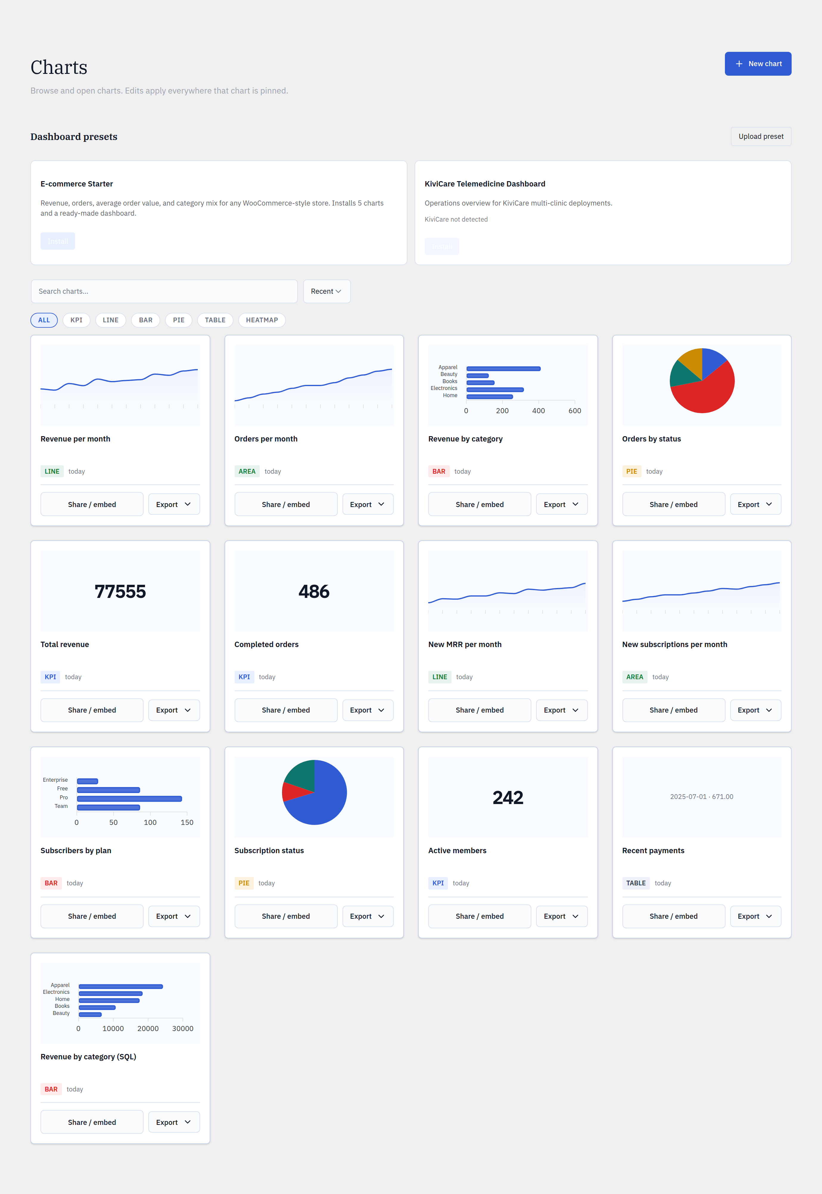
Chart types
Seven ways to read your data, all themed with one editorial ApexCharts design system so a Glimpse BI chart looks the same on every site.
Step by step
- 1In Builder, pick the visualization type that fits your question.
- 2KPI for a single headline number; line / area for trends over time.
- 3Bar for comparing categories; pie for parts of a whole.
- 4Table for exact values with pagination and search; heatmap for density across two dimensions.
- 5Funnel (Pro) for step-to-step conversion.
yoursite.com/wp-admin/admin.php?page=glimpsebi-charts
Choosing a type
KPIs answer “how many / how much” at a glance. Line and area show change over time. Bar and pie compare categories (bar when there are many, pie for a few parts of a whole). Tables are best when readers need exact rows. Heatmaps reveal concentration across two dimensions.
One shared theme
Every chart merges the shared design-token ApexCharts theme before rendering, so colors, typography, and spacing are identical across charts, dashboards, embeds, and even a future second CMS port.
Reference
Free typesKPI · line · area · bar · pie · table · heatmap
Pro typeFunnel
RendererApexCharts + shared token theme
TablesPaginated + searchable (25/50/100/200 rows)
Bring your WordPress data into focus.
Install the free plugin and build your first chart in minutes. Upgrade to Pro when you outgrow the caps.